pacman::p_load(ggtern, corrplot, ggstatsplot, seriation, dendextend, heatmaply, tidyverse)In-class Exercise 5
Creating Correlation Matrix and Plot
Installing the R packages
Importing and Preparing the data
wine <- read_csv('data/wine_quality.csv')Building a basic Correlation Matrix
pairs(wine[,1:11])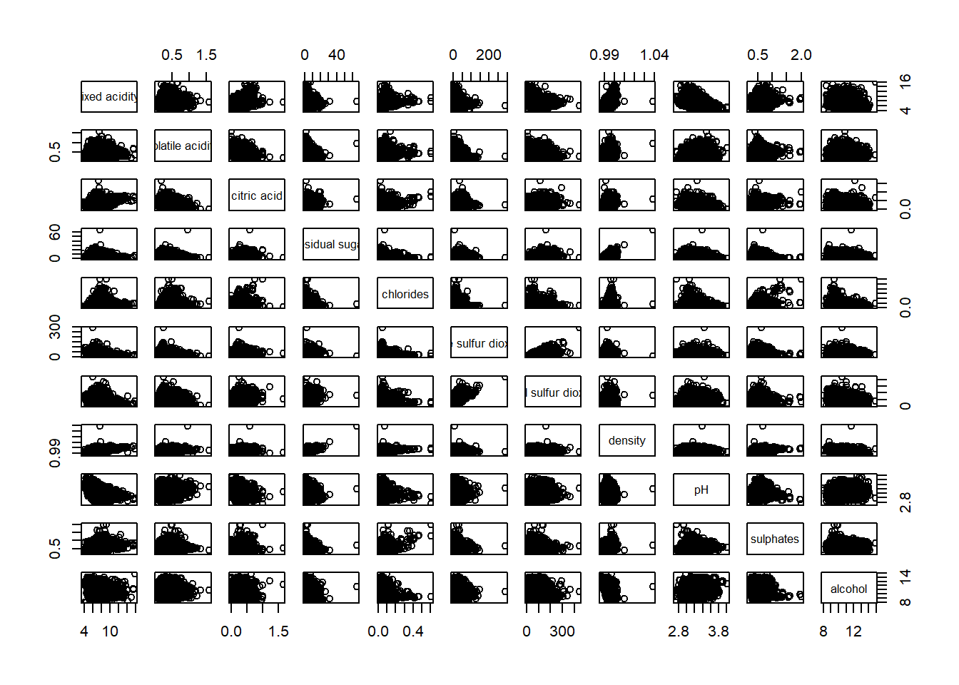
Correlation plot
#ggcorrmat(data = wine, cor.vars = 1:11)Correlation matrix with adjustments
# ggstatsplot::ggcorrmat(
#   data = wine,
#   cor.vars = 1:11,
#   ggcorrplot.args = list(outline.color = "black", hc.order = TRUE,tl.cex = 10),
#   title    = "Correlogram for wine dataset",
#   subtitle = "Four pairs are no significant at p < 0.05"
# )
Note: Tidyverse package can mess with the select function. To prevent this, you can call the dplyr package to run the select function (dplyr::select)
For creating a corrplot, one needs first create a correlation matric table
wine.cor <- cor(wine[, 1:11])Creating the corrplot
#|fig-width: 9
#|fig-height: 9
corrplot.mixed(wine.cor,
               lower = "ellipse",
               upper = "number",
               tl.pos = "lt",
               diag = "l",
               tl.col = "black")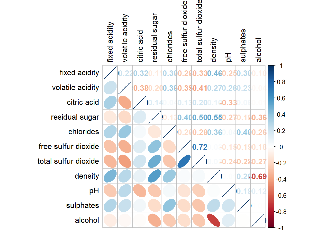
Creating ternary plots
Import the data
pop_data <- read_csv("data/respopagsex2000to2018_tidy.csv") Preparing the data
agpop_mutated <- pop_data %>%
  mutate(`Year` = as.character(Year))%>%
  spread(AG, Population) %>%
  mutate(YOUNG = rowSums(.[4:8]))%>%
  mutate(ACTIVE = rowSums(.[9:16]))  %>%
  mutate(OLD = rowSums(.[17:21])) %>%
  mutate(TOTAL = rowSums(.[22:24])) %>%
  filter(Year == 2018)%>%
  filter(TOTAL > 0)
Plotting ternary plot
ggtern(data = agpop_mutated, aes(x = YOUNG, y = ACTIVE, z = OLD)) +
  geom_point() +
  labs(title="Population structure, 2015") +
  theme_rgbw()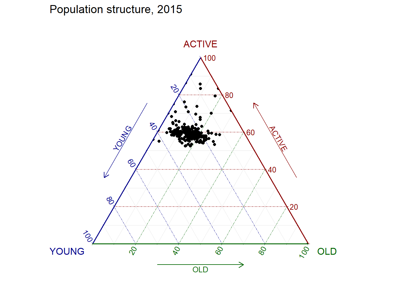
Creating a Heatmap
Importing the data
wh <- read_csv("data/WHData-2018.csv")Preparing the data
Replace index with country name column
row.names(wh) <- wh$CountryTransforming the data frame into a matrix
wh1 <- dplyr::select(wh, c(3, 7:12))
wh_matrix <- data.matrix(wh)
Plotting the heatmap
Using heatmaply, we plot the heatmap excluding some column values
heatmaply(wh_matrix[, -c(1, 2, 4, 5)])